Flora
Plant-based milk and provisions delivered in reusable containers
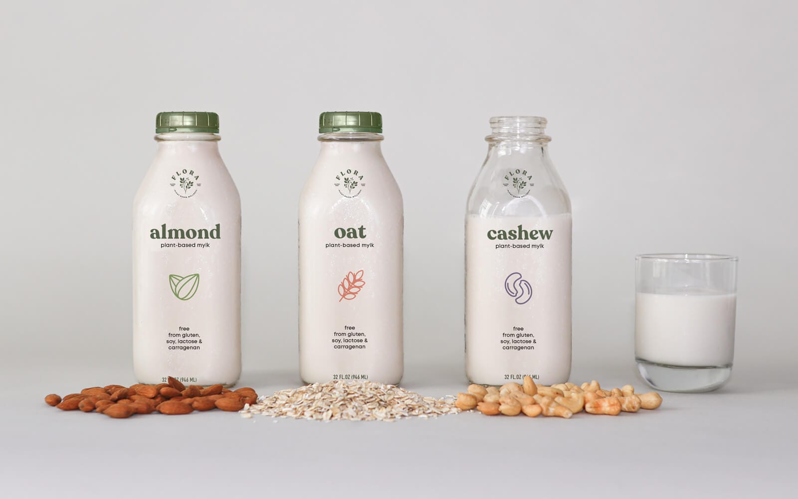
Brand Identity, Packaging, Illustration, UX, UI
January - March 2021
Overview
Flora is a new plant-based milk brand that is launching in Southern California. A revival of the vintage milk-delivery concept, Flora brings plant-based milks and other provisions directly to the doorstep of its eco-conscious customers in reusable containers. Flora’s line of products are made in small batches from high quality, local ingredients with an emphasis on sustainability. This helps reach their target audience of progressive, middle-high income individuals and families, ages 27–41, who are willing to pay more for products that are in alignment with their health and ethical ideals.
Solution
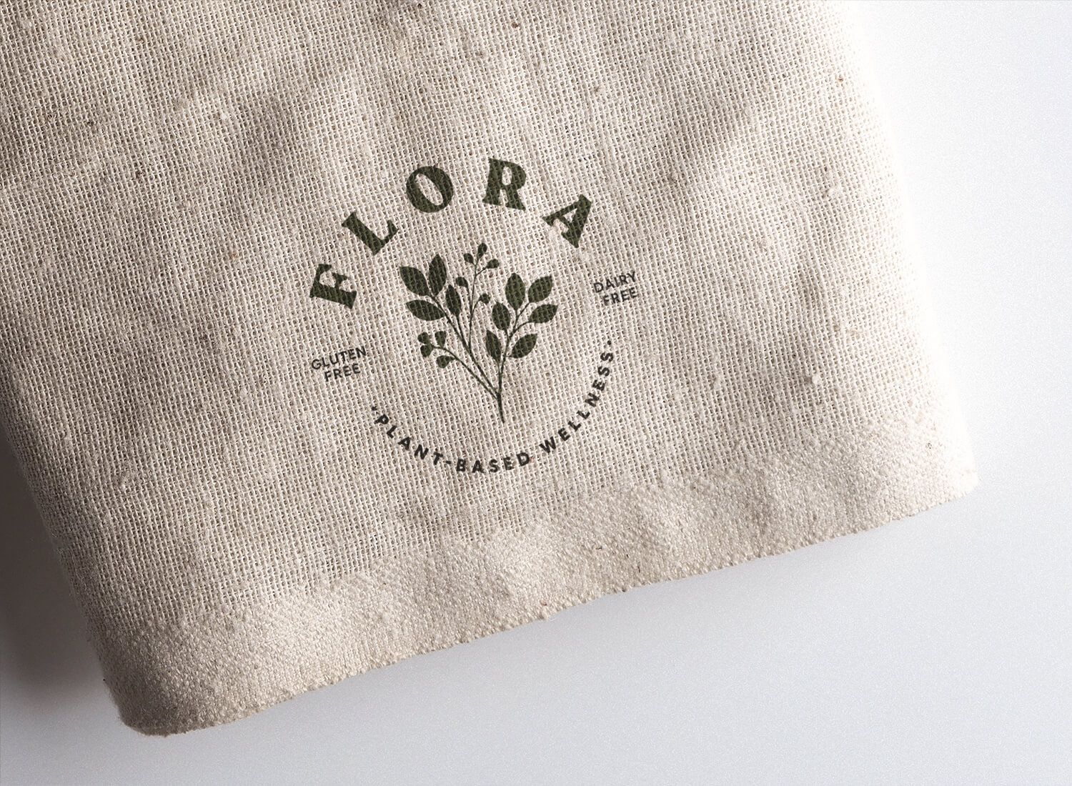
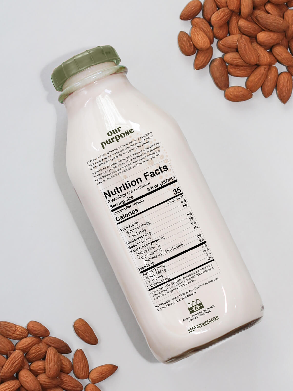
Flora’s brand system evokes purity through a clean and soft aesthetic. A clear glass bottle was selected to convey transparency and the product's natural colors to be visible. The bottle’s vintage shape helps differentiate from supermarket competitors and references the era of when local milk-delivery was the norm. The brand’s palette of natural pastel colors has a soft and calming feel. The Recoleta typeface, with rounded serifs and gentle curves, helps give the brand a sweet and charming voice. This is paired with Lorin, a geometric sans-serif, which provides utility with a touch of contemporary sophistication.
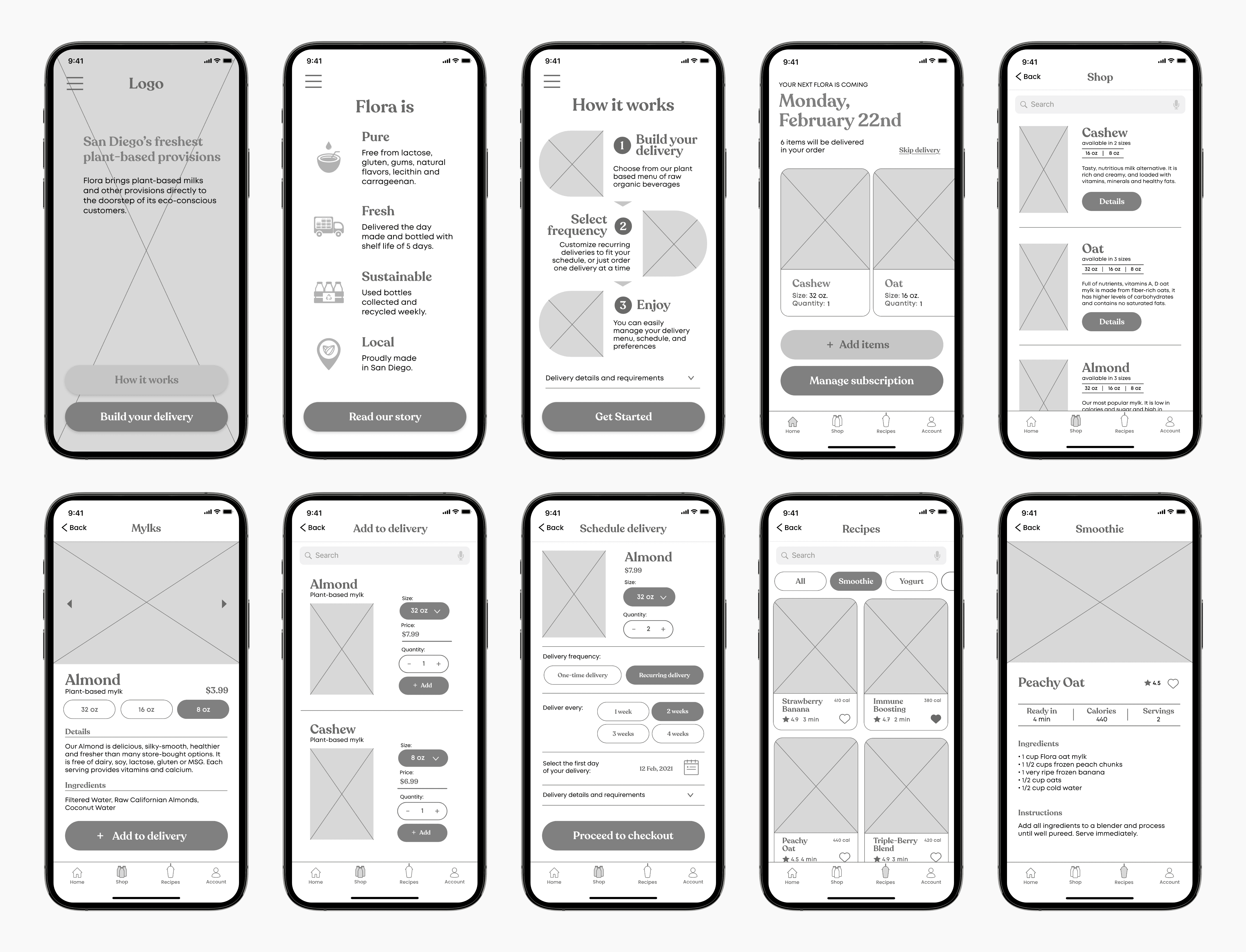
Mobile App
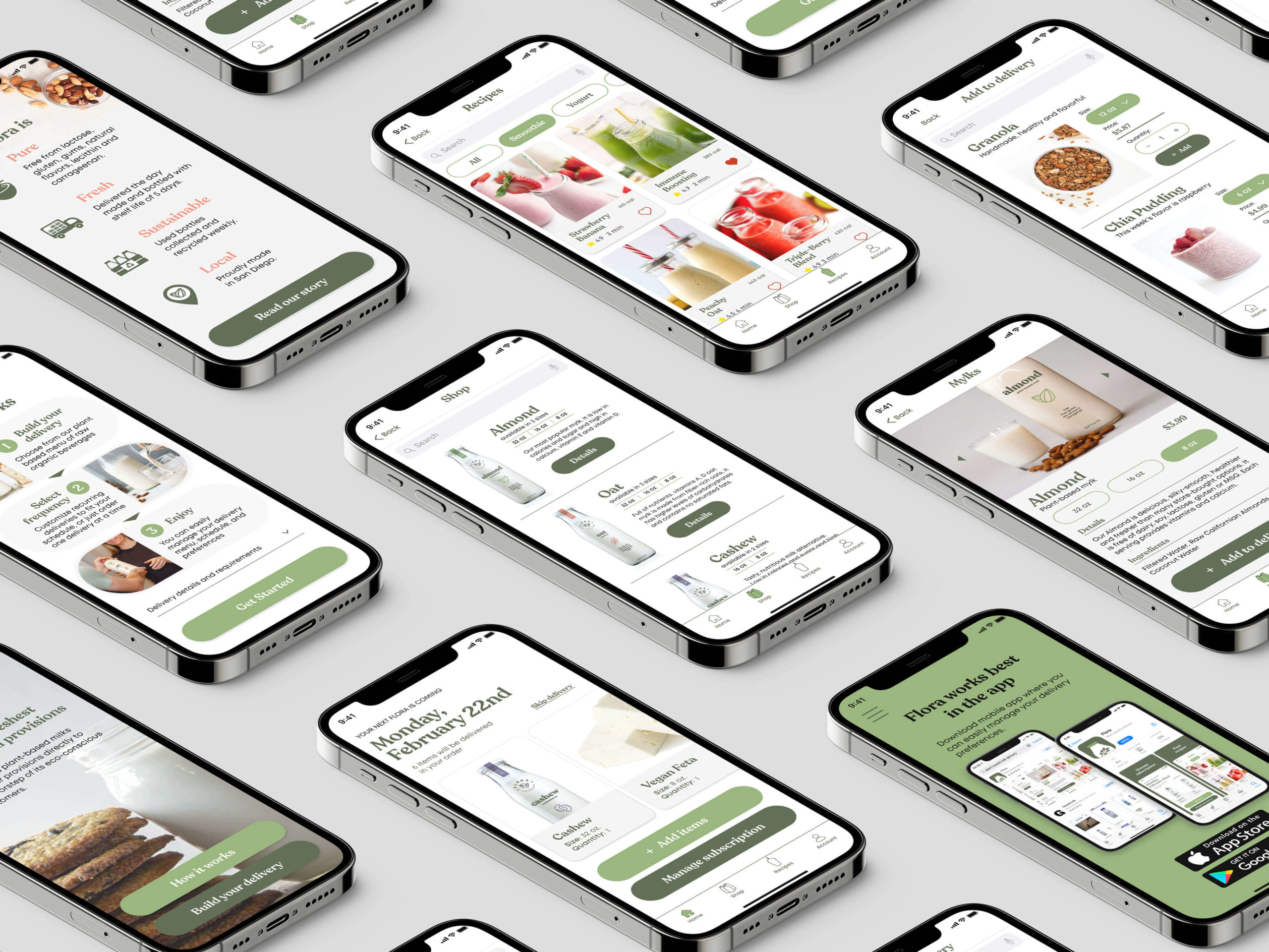
Flora offers a mobile app where subscribers can easily manage their delivery preferences and look up recipes.
Other Projects

Fisker OceanHMI, UX, UI

Fisker PEARHMI, UX, UI

FeyaUI, UX, Branding
SproutsCorporate Rebrand

GamutBranding, Packaging, Typography
195 HotelBranding, Packaging

99URedesign, Typography, Page Layout
AutographTypography, Page Layout

The Great GatsbyIllustration
© Anna Karpova 2025