195 Hotel
Luxury hotel concept with rooms that draw inspiration from cultures around the globe
Brand Identity, Packaging, Illustration, UX, UI
January - April 2020
Overview
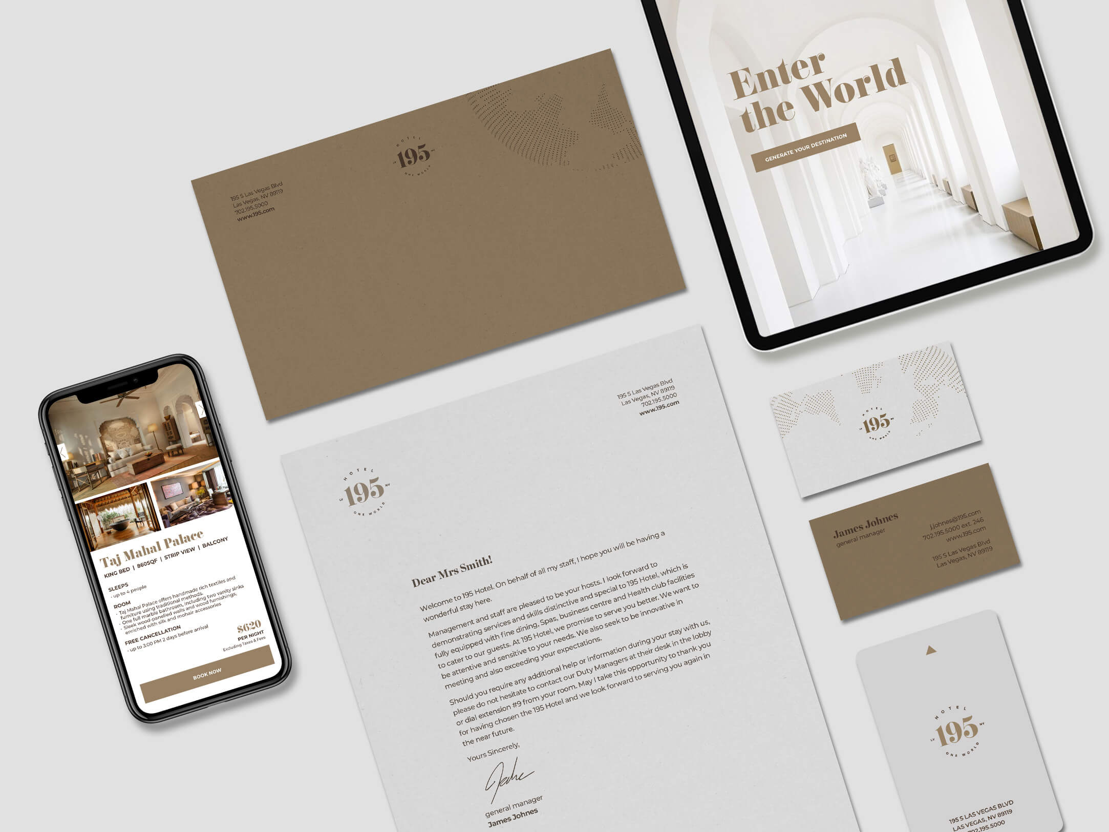
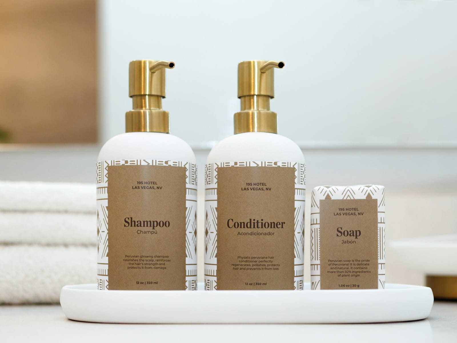
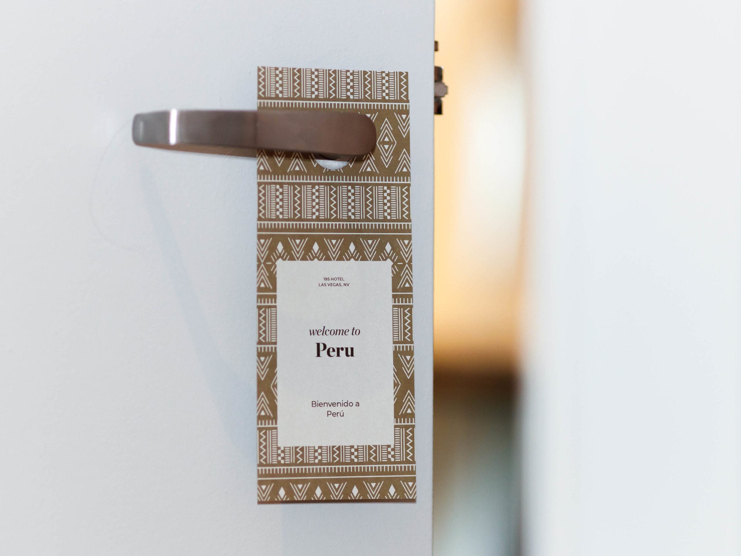
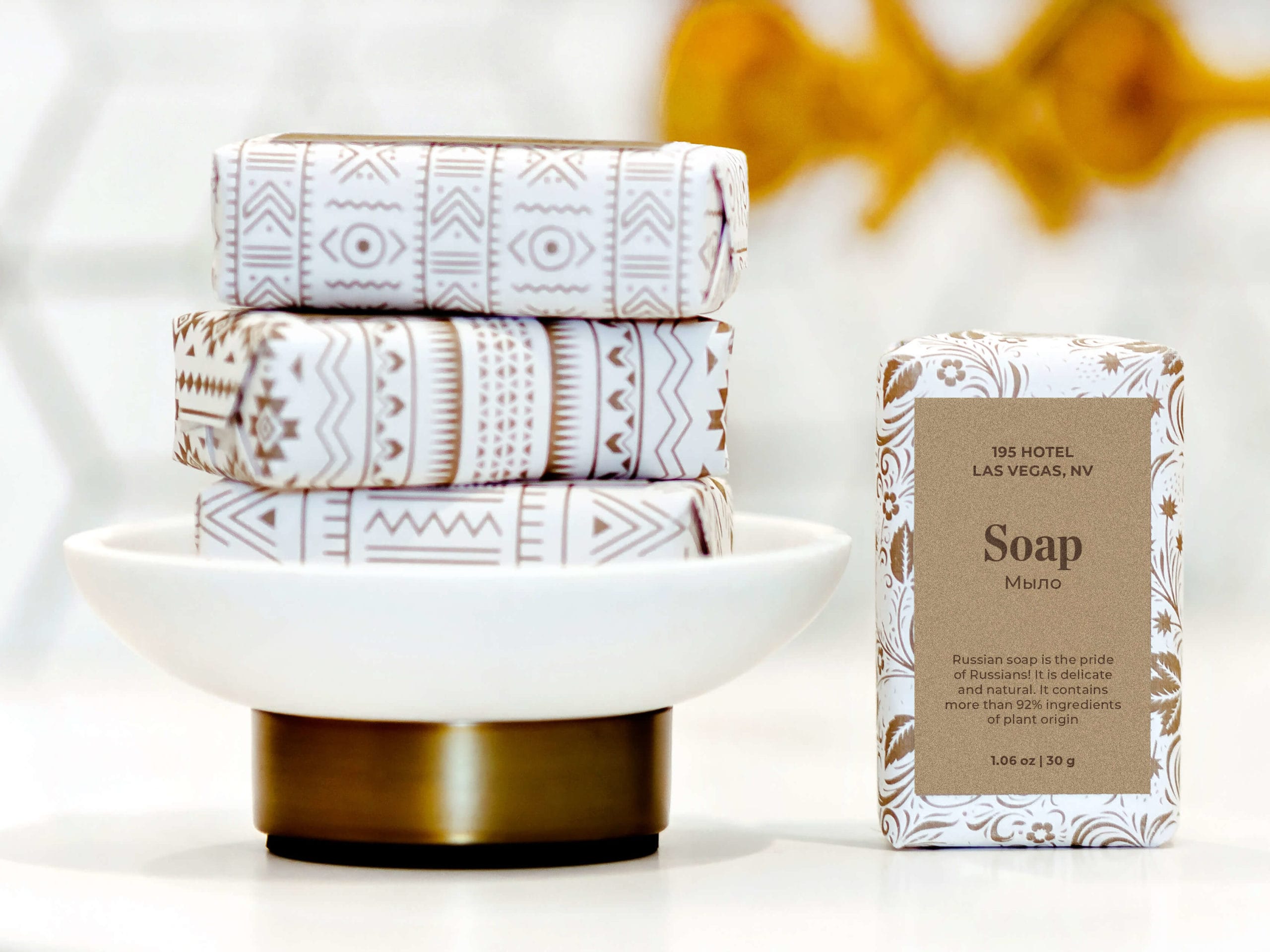
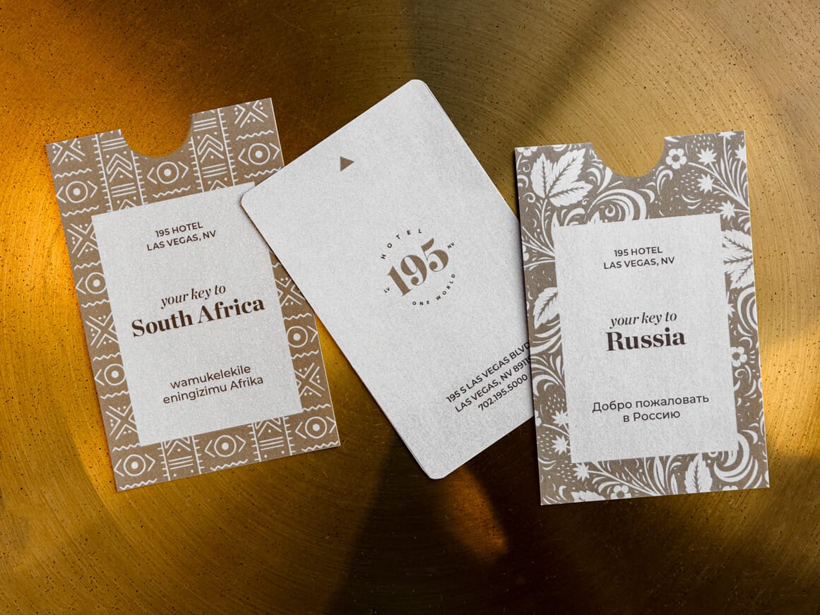
195 is a new luxury hotel located in Las Vegas. The hotel has 195 rooms and suites that are themed from cultures around the globe. Each room is named after the country it portrays. To occupy a distinctive place in the highly competitive market, 195 offers a memorable experience at a high-level price point. The hotel has a primary target audience of high-income individuals and couples, ages 40–55, who are looking for an unforgettable getaway.
Solution
The 195 brand uses a luxurious color palette of gold, brown, and light grey colors, giving it a high-end and classic look. A series of patterns is used to authentically showcase the culture that is connected to each room, but all share one color palette to keep them cohesive. Chronicle Display is used for its timeless, high-contrast construction and extensive weights that add utility to the branding system. This is paired with the geometric sans-serif Montserrat for its readability and contemporary proportions. The logo was modified from the Eloquent typeface, whose high-contrast lines give the mark a unique look.
Positioning

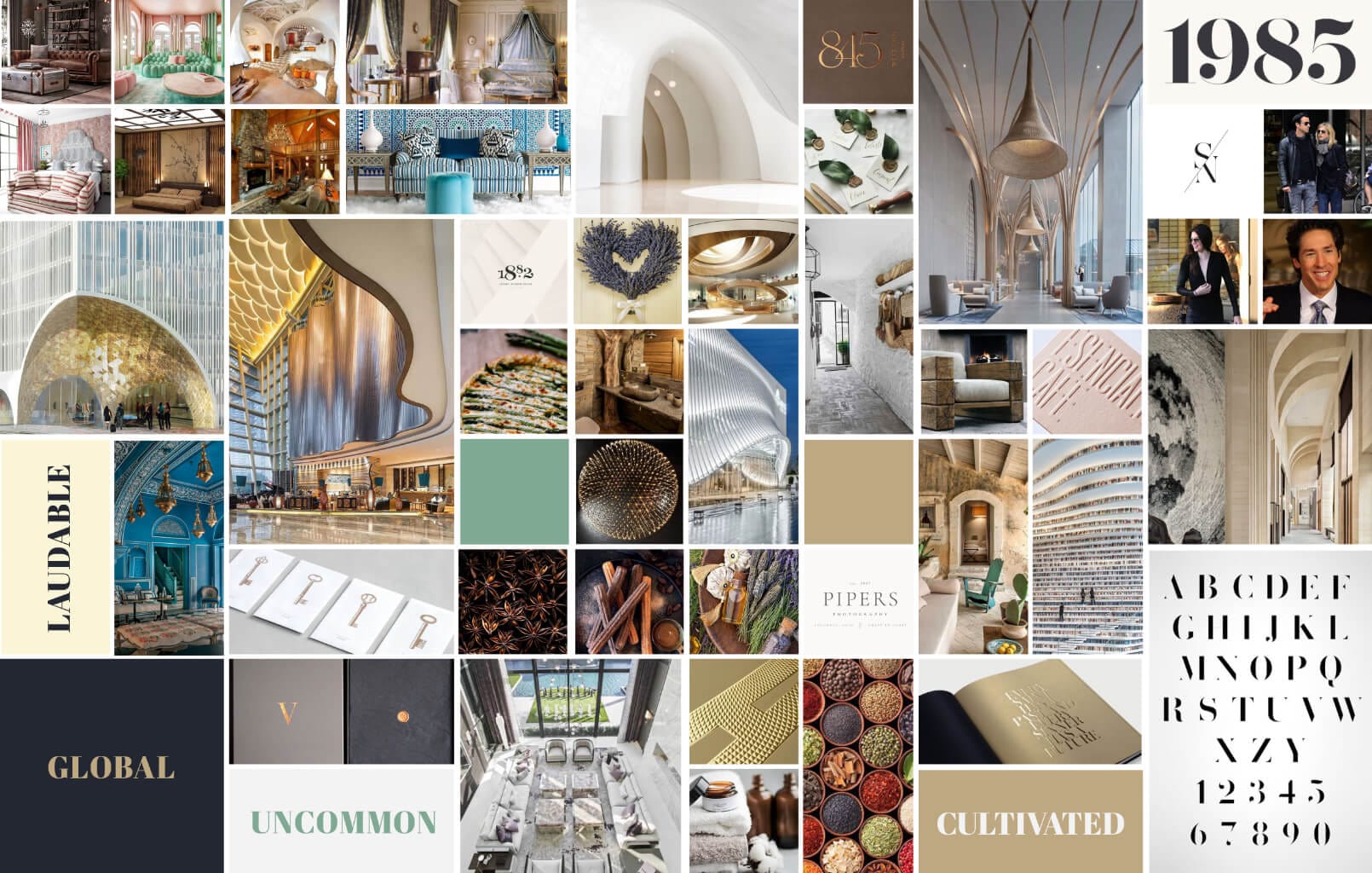
Mood Board
Other Projects

Fisker OceanHMI, UX, UI

Fisker PEARHMI, UX, UI

FeyaUI, UX, Branding
SproutsCorporate Rebrand

GamutBranding, Packaging, Typography
FloraBranding, Packaging, UX, UI

99URedesign, Typography, Page Layout
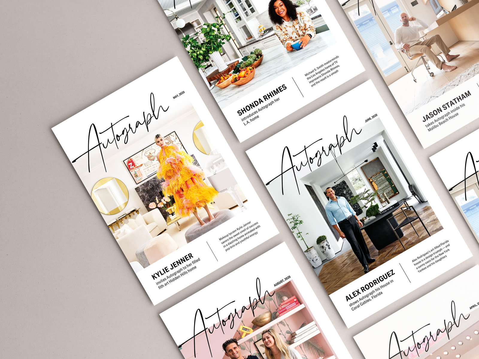
AutographTypography, Page Layout

The Great GatsbyIllustration
© Anna Karpova 2025